Syracuse Orange Blogger Award for Ugly Ass Uniforms
Posted by Tim on March 28, 2007
Nike couldn’t be here to accept this award today, so I hope you won’t mind if I make a little speech on its behalf.
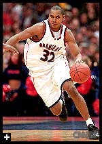
The ballots have been counted and the verdict is in: SU hoops bloggers really, really don’t like the new uniforms. Personally, I suspect our reaction has much to do with all the changes the unis have undergone since we won the national championship back in ’03. Why mess with success? True, we’d been rocking that style since the days of Ryan Blackwell. But this is the third change in four years. And it’s actually the second sartorial intervention this season; if you recall, some of the typefaces and other minor details were tweaked before the season began. Was it all really necessary?
If the Orange blogosphere is to be trusted, the answer is a resounding “Um, no.”
Here’s a sampling of the invective we directed at SU’s new, form-fitting attire:
Orange Ray of OrangeHoops: “Not nearly as bad as the promos led me to believe, but I’m still a fan of old school uniforms.”
Howie of Sports Night With Howie Mansfield: “I still hate them.”
Matt of Orange44: “Still hate them and I stick by this piece on the FanHouse.”
Josh of Cuse Country (represent!): “I think the white ones look good but the orange ones are tough to handle. And, I am still miffed that the word Syracuse appears nowhere on the jerseys.”
Yours truly: “They made Mookie look like The Thing (enormous, orange, etc.). Though there might be some intimidation factor there, I still think they look ridiculous.”
Sean of Troy Nunes Is An Absolute Magician: “Not as bad as I thought at first. All of this drama could have been avoided if they didn’t include those skin-tight undershirts with the uniform photos. You know…the thing no one wears anyway. That was what made the whole thing look silly. Without that, the jerseys are basic but nothing we can’t get used to.”
There was one lone dissenter in the group. DutchHart at Getting Back to ’03 apparently loved the new look. It takes guts (or blindness) to be the lone dissenter here, so our hats are off to him.
Next up: Best Syracuse-related Photo. Check it out over at Sports Night With Howie Mansfield at 3 p.m. EDT.

DutchHart said
Of course I have to defend the decision… My choice was not based on a aesthetics on how they look, but the fact that they would be amazing to play in. A classic jersey tends to be more baggy, while a form-fitting jersey is less likely to impede any arm motion, prevent defenders from checking you by grabbing as much, etc. I don’t know, maybe I’m partial from wearing form-fitting football jerseys and such for so long, but I feel that it would be an advantage to the team wearin the new jerseys…
voteprime said
I really hate the white ones. They’re just too white. And the silver only adds to that washed out look. Then when Rautins is wearing it…anyway.
But then again, I love me some orange.
And those extra baggy shorts, I just don’t get, especially with the trimmed down tops.
Somewhat related to this discussion, what I really hate is how the school is implementing this new block letter “S” as the logo. I had no problem with the “SU” but if Gross feels longterm this is better for the Syracuse identity, I can live with it.
But then why do they have to put the word “Syracuse” in an arch above the S everywhere you print the logo? It’s on the center court, it’s on the side of the shorts, it’s on the logo whenever it is used by TV. And I think it just looks silly. It takes away from the simpleness and the solidness of the S. It’s saying we’re not confident that people will know what school this orange S is referring to.
You don’t see “Michigan” written above their yellow M. Or “Michigan State” above their green S. Standford’s red S stands alone.
Is adding that “syracuse” kind of a breaking in process? Are they giving people a label to avoid confusion for the first season and then take it away next year, hoping people will have absorbed the new brand? Whatever the reason, it’s really been bothering me all season.
syracusan said
When I was contributing my portion of the Cuse Country ballot, I think I abstained on this question. I think the jury is still out, but so far I still don’t dislike them.
The road unis, however, I can get down with. The unabashed, blinding, garish, overwhelming, borderline offensive assault of orangeness clicked with me. It’s so hard to look at, it ends up coming full circle and being good again. Opposing team’s fans probably have a hard time looking directly at our guys when they’re wearing the roadies, and that’s got to be some kind of advantage.
Jeff said
Re: the uniforms…yack.
gmacmoney said
After that picture in the paper, I was REAL nervous as to what they were going to look loke, but after seeing them on the players, they have grown on me. Harris looks the best in them
HoustonCuse said
Come on guys the new unis look really good. I was iffy on them at first, but Andy putting a regular T-shirt under his really helped me start liking them. They look real sharp to me.
As to the comments by Voteprime about the “S”. My understanding was that Michigan State sued SU over the use of a bigg-ass “S” since they apparently trade-marked that (in any color). That’s why they have to have “Syracuse” written over the top. Of course on the new uni shorts, it is just a big “S” so maybe I am full of crap.
One thing no one mentions: the new shorts are freakin cool. The throwback stripes, the bigg-ass “S” and the player’s number on the shorts are all very cool.